Designing an interface
Published by James on 16/01/2023After completing the basic elements of our Kinoko game’s platforming last weekend – and thereby wrapping up ‘phase one’ of the game’s development, which was basically just to prove to myself that I’m even capable of putting a game together at all – I decided that it’d be best to focus my efforts next on something a little less exciting, but still extremely important for a functioning, playable game: saving and loading!
We’re not doing anything particularly unique or original in this regard, and we haven’t actually decided on many of the finer details just yet, so allow me to gloss over it quickly. Our game offers four distinct save slots, and you can play in any one of them. Anything you do in a given save slot will be persisted, meaning that you can safely shut the game down knowing that Kinoko will be there waiting for you to resume your adventure together when you return.
Currently, the game auto-saves whenever you switch map (which, given the way the game is being set up to work, you’ll be doing often), exit to the main menu, or quit the game. We’re unsure if that’s the approach we want, or if we fancy something a bit more ‘old school’, but in any case the system works and we’re able to configure it however we like now.
Whilst I got saving and loading working functionally, Chelsey started the process of designing graphical interfaces.
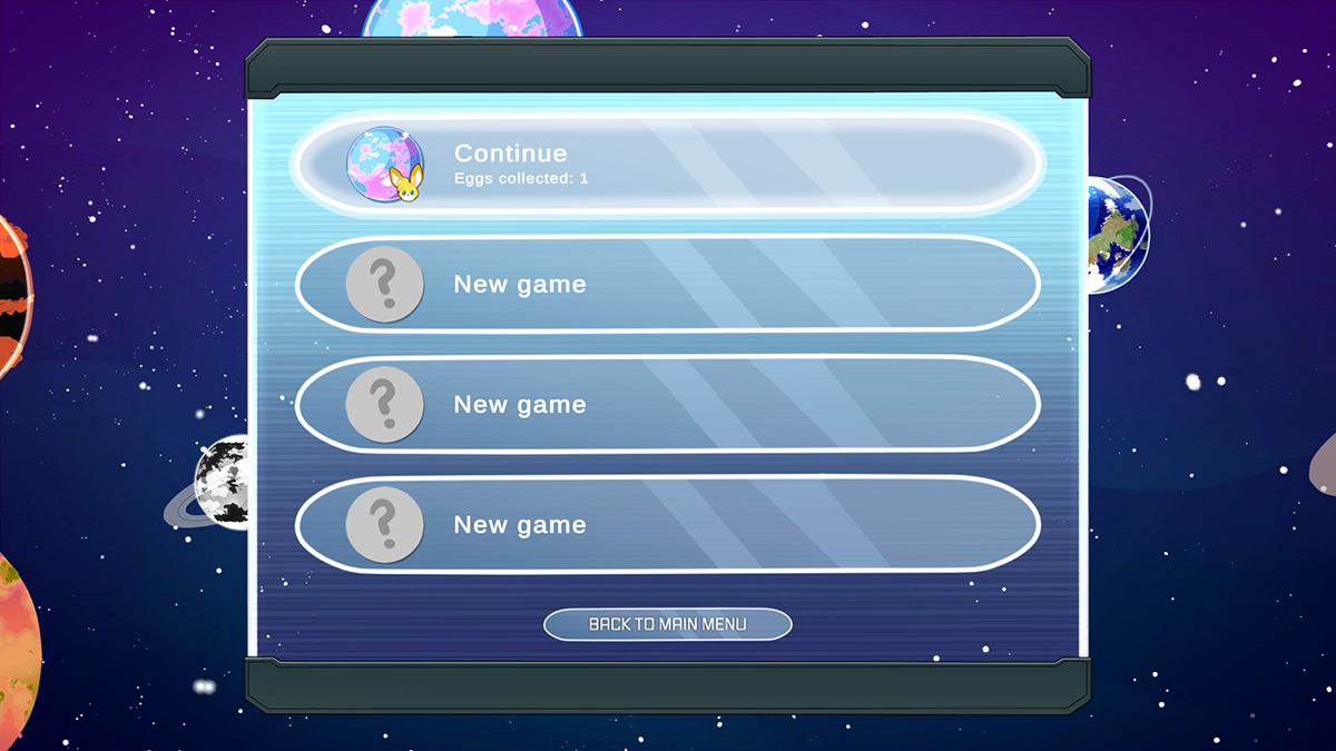
And there it is! The screenshot above shows our current prototype of the save slots menu, which works exactly as it should do. You can select a slot using either your mouse, or by using the buttons on your keyboard or gamepad and then pressing the ‘submit’ button (either ‘enter/return’ on the keyboard, or ‘A’ on the gamepad). There’s also a button here to return to the main menu, as there’s another screen before this one which we’ll get to in a minute.
When designing these menus and creating the graphics, Chelsey was interested in going for a ‘space exploration’ aesthetic – something that perhaps feels like you’re in a space station, or navigating the onboard control panels in a space ship. The glossy panels go some way towards reflecting this, but the real highlight of these menu screens in my opinion is the background. The background’s stars and planets have been set up to slowly move across the screen and then gradually loop back around, creating the feeling of being slowly orbited by planets.
This gentle animation is intended to be accompanied by a soft, soothing soundtrack. Just for the sake of prototyping, we’re currently using the main menu track from Spore here. It’s got the type of sound we’re thinking of, and being able to hear it as we test helps us inch closer towards capturing the vibe that we’re after.
We don’t know for sure yet if this is the direction that we’re going to be taking the interfaces in long-term. We might feel like trying something different as time goes on. For now, though, we’re both really pleased with how the menus look and feel, and it’s the first time that we’ve really been able to see what our combined efforts look like, when I’m coding to the best of my ability, and Chelsey’s designing and drawing to the best of hers. Chelsey wants to try rotating those planets as well as orbiting them, so we may investigate that later.
Something I’m personally a huge fan of is Chelsey’s idea of displaying the icon for the current planet alongside each save slot, as well as the head of the kuparkuke you’re currently… whoops, sorry. Please pretend you didn’t read that bit!
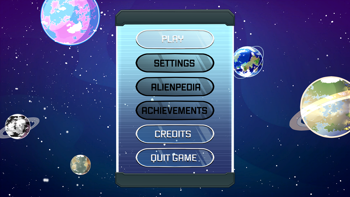
And here’s the main menu. There’s not a lot that you can actually do here at the moment, with three out of the six buttons being completely disabled, but it gives you an idea of the sort of functionality we plan to offer here. It gives you a better view of those planets and stars, at least!
So, that’s pretty much where we’re at since last weekend’s update. Saving and loading work, spare for a couple of outstanding bugs that I think I know how to fix, and now we’re ready to think about how exactly we offer that saving facility to the player (be it via auto-saving, via the pause menu, via the hub area like in Crash Bandicoot 2, via specific save points like in Hollow Knight, via finite pickups like in Tomb Raider 3, etc). The user interface has come a long way, and it’s completely interactive except for a few disabled buttons. It already looks pretty polished. We’ve got music playing, and we’ve even got a few sound effects in there, too.
There’s absolutely loads we could do from this point forward to improve our menus, but I reckon we’ve done enough to be moving on with for now. The main point of this whole exercise has been that saving and loading works now, and there’s a user-friendly way of getting the prototype running and switching between the different save slots. I think it’s time now that I was getting back to working on the gameplay side of things – but what will it be?
I was thinking about maybe adding Kinoko’s first enemy…


